
From fixed price to free market
Gold was pegged for most of the twentieth century, which makes early price charts more a record of policy than of markets. Once convertibility ended in 1971 the price floated, and everything meaningful about gold's behaviour as an investable asset dates from then.
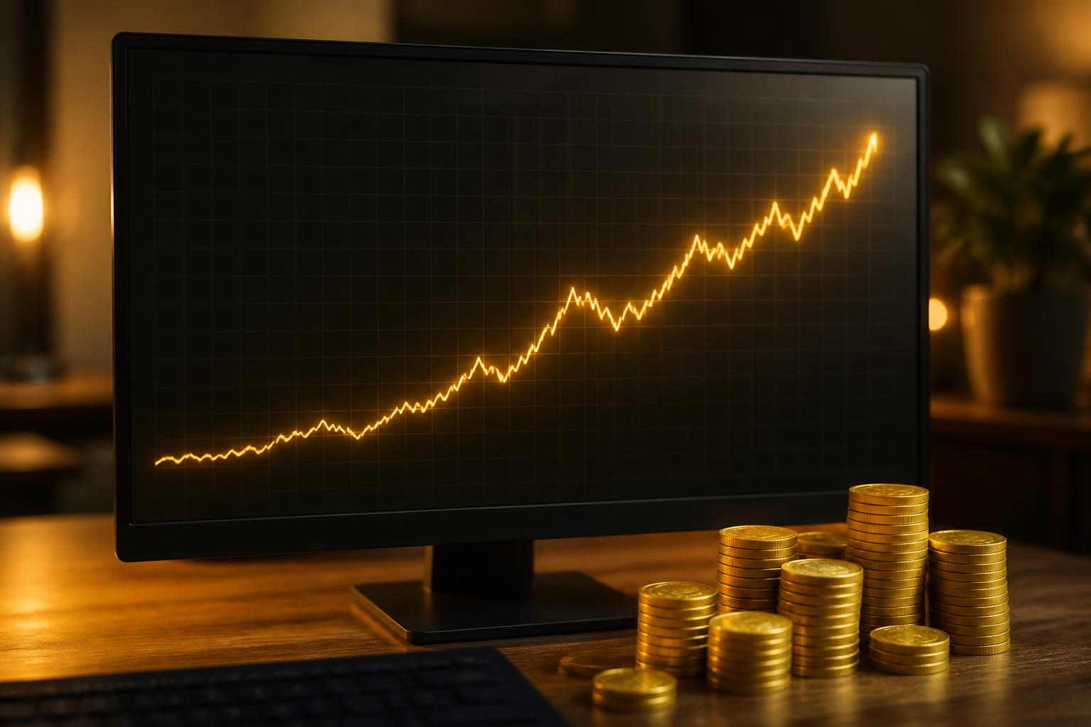
Describe this illustration: Rising long-term gold price chart on a monitor behind stacked gold coinsHide description: Rising long-term gold price chart on a monitor behind stacked gold coins
Gold's long-term price record is a measure of what paper currency does, not just what the metal does. The multi-decade chart behind these coins shows gold measured across decades rather than quarters — a steady response to the debasement of the dollar. Capstone Metals frames every long-term gold and silver price chart in that perspective, so the question becomes not whether gold rose, but what happened to the purchasing power it is measured against. Live spot prices, historical context and allocation guidance sit on one desk, so a buyer acts on perspective rather than a headline.
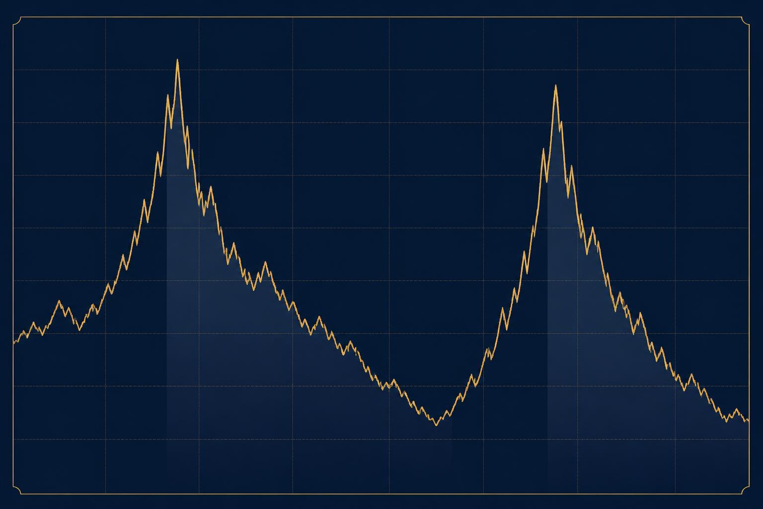
Describe this illustration: Chart of the gold price marking the extended declines that followed the 1980 and 2011 peaksHide description: Chart of the gold price marking the extended declines that followed the 1980 and 2011 peaks
The stretches gold marketing crops out of the chart. This original Capstone Metals chart illustrates chart of the gold price marking the extended declines that followed the 1980 and 2011 peaks. It is educational artwork, not a price forecast, performance record or recommendation.